
I’m looking for zoom interview tops in colors that look great on camera without relying on a polished studio setup. This comparison uses a webcam frame, window light, and the same simple crop each time. The biggest differences come from color, neckline, and surface texture. You’ll want shades that stay clear when the call gets small.
For a quick route through the guide, start with the cobalt-blue test, compare the jewel tones, then check the cost table. You don’t need a new wardrobe to find a confident, camera-friendly option.
Here’s what it looked like before
Before this edit, the virtual interview wardrobe was a rack of attractive tops that became confusing on screen. The colors were close together, the necklines competed with the face, and several fabrics reflected the window like a pale flash. You can like a blouse in person and still lose its shape inside a small video rectangle.
The setup stayed plain: one webcam, a neutral background, and daylight from one side. Dramatic filters weren’t part of the test. Once the frame was frozen at thumbnail size, the winning top had to read quickly, sit neatly at the shoulders, and give the face enough contrast without becoming the whole image.
A useful top also has to justify its price. If a $20 secondhand blouse stays clearer than a $90 glossy one, the cheaper option has better value. That’s the kind of practical comparison worth making before you buy.
The neckline check and still-frame decision matter just as much as color. A vivid shade can still fail if the collar disappears or the fabric turns restless.
- I Chose Cobalt Blue for Instant Camera Clarity
- What Jewel Tones Did I Keep?
- The Quiet Pattern Rule
- Coral and Earrings Need Restraint
- Emerald vs. Navy: The Dark Color Split
- Why Ivory Needs Brighter Daylight
- Check the Neckline Window
- Try Burgundy When Black Feels Harsh
- Mustard’s Warm Frame Check
- Could Lavender Be the Softer Pick?
- The Still Frame Decision
- The Vividness Hold Test
1I Chose Cobalt Blue for Instant Camera Clarity

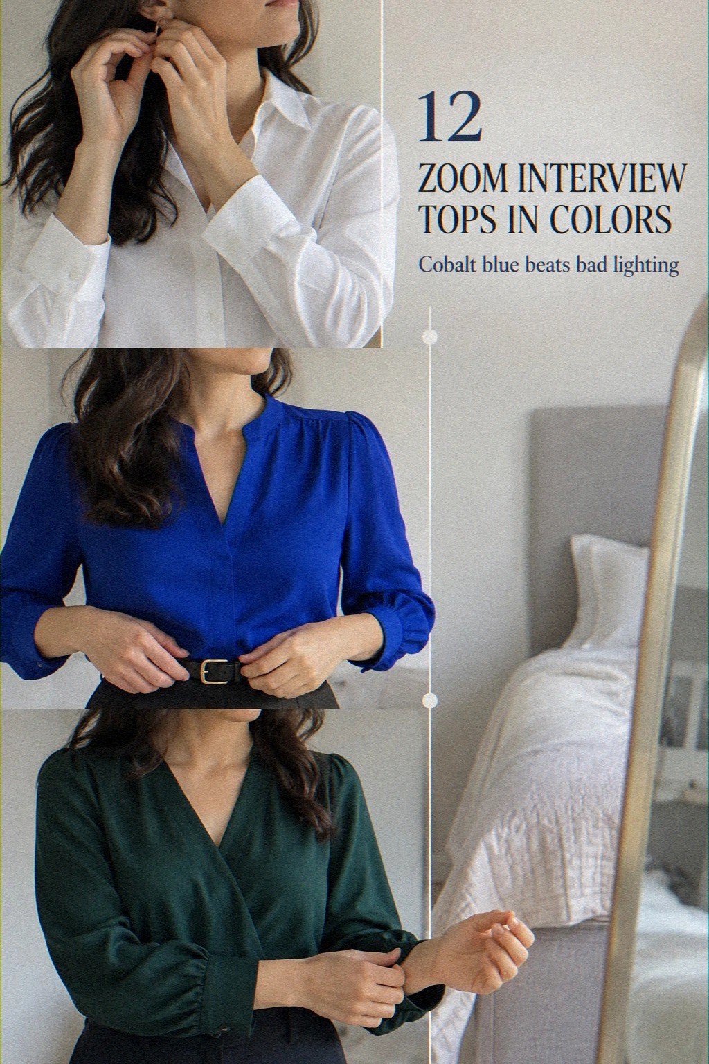
Cobalt blue gives the first frame a clean edge. The shade looks vivid beside a pale webcam background, while matte woven fabric keeps the color from breaking into glare.
A relaxed button-front silhouette with a crisp collar matches the saturated shade without making the outfit feel stiff. You’ll want enough room through the sleeves, since bunching near your elbows can create distracting dark folds.
This became my Blue Frame Rule, a simple test for a video interview outfit: choose one strong color, one quiet texture, and one defined neckline. I’d skip a shiny cobalt satin top for a long interview. It catches every small movement and can look patchy when the camera compresses the image.
A cotton poplin or medium-weight crepe gives you a steadier block of color. The result feels polished, modern, and surprisingly calm. If you’re shopping on a tight budget, cobalt is worth considering because it can work with simple black, navy, or gray trousers.
For the full comparison, return to this cobalt-blue section after reading the darker options. It’s a strong starting point when you want a memorable shade with minimal styling effort.
2What Jewel Tones Did I Keep?
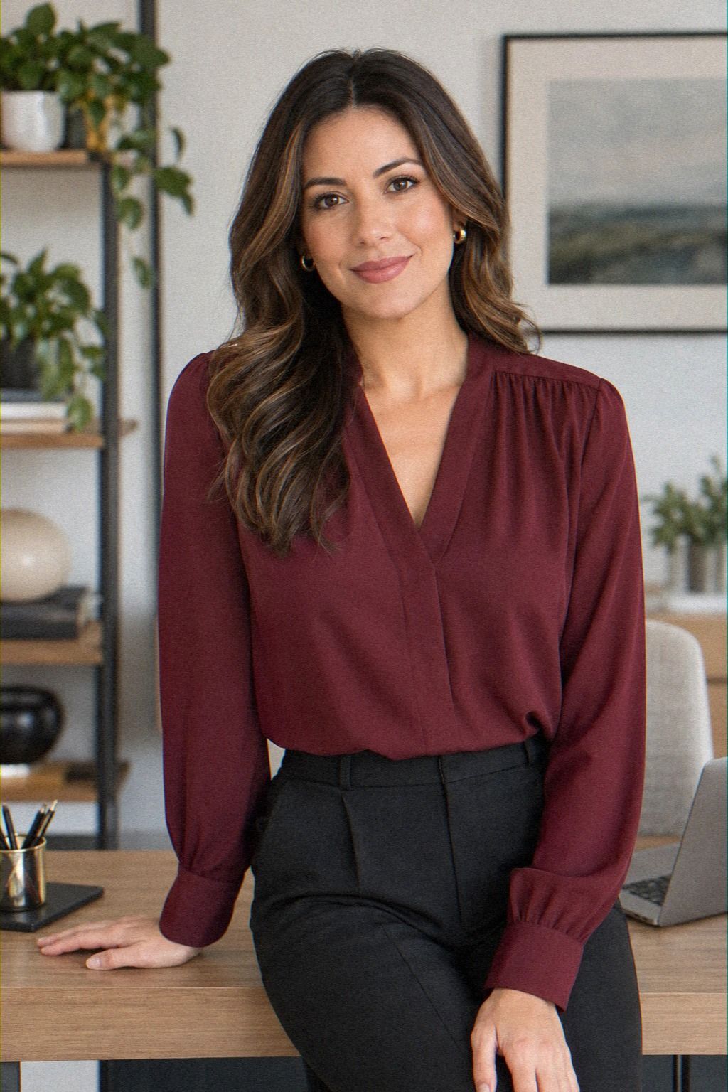
Jewel tones need separation, not just intensity. Emerald, sapphire, and deep burgundy create different results in the same camera crop.
Emerald looks rich in the frame, but sapphire holds its outline better beside a dark chair. Burgundy gives the face a warmer boundary.
The best choice depends on the surrounding colors too. Against warm beige, a cool jewel tone can look crisp.
Beside a blue-gray wall, you may want a shade with more warmth. The Three-Frame Color Test checks daylight, indoor lamp light, and a paused thumbnail.
If one shade disappears in one of those views, it isn’t dependable enough for an interview. That doesn’t mean the color is unattractive. It means the camera is giving it poor working conditions.
For buying value, jewel tones are useful because one blouse can serve interviews, presentations, networking calls, and other polished occasions. A versatile shade earns its keep more easily than a top that only works with one background.
The warm burgundy option is especially useful when black looks severe. You’ll also find a softer alternative in the lavender section.
3The Quiet Pattern Rule

Tiny prints are the easiest option to reject. A fine dot, narrow stripe, or miniature floral may look charming at full size, but the webcam can turn repeated marks into visual noise. The effect is especially noticeable around the shoulders, where the camera has fewer pixels to describe the pattern.
A soft neutral blouse with a broad check woven into the fabric gives the surface dimension without creating a strobe-like effect. The Quiet Pattern Rule is simple: if you can’t identify the repeat in one glance, your camera may not identify it either.
I’d skip pinstripes for this reason. They’re neat in person, but they can shimmer beside a moving face.
Your words should hold attention, not your shirt. A clean solid top is often the safer budget choice because it avoids paying more for a print that performs worse onscreen.
That makes the pattern rule useful when comparing new and secondhand options. It’s a small, inexpensive adjustment with a surprisingly polished result.
4Coral and Earrings Need Restraint
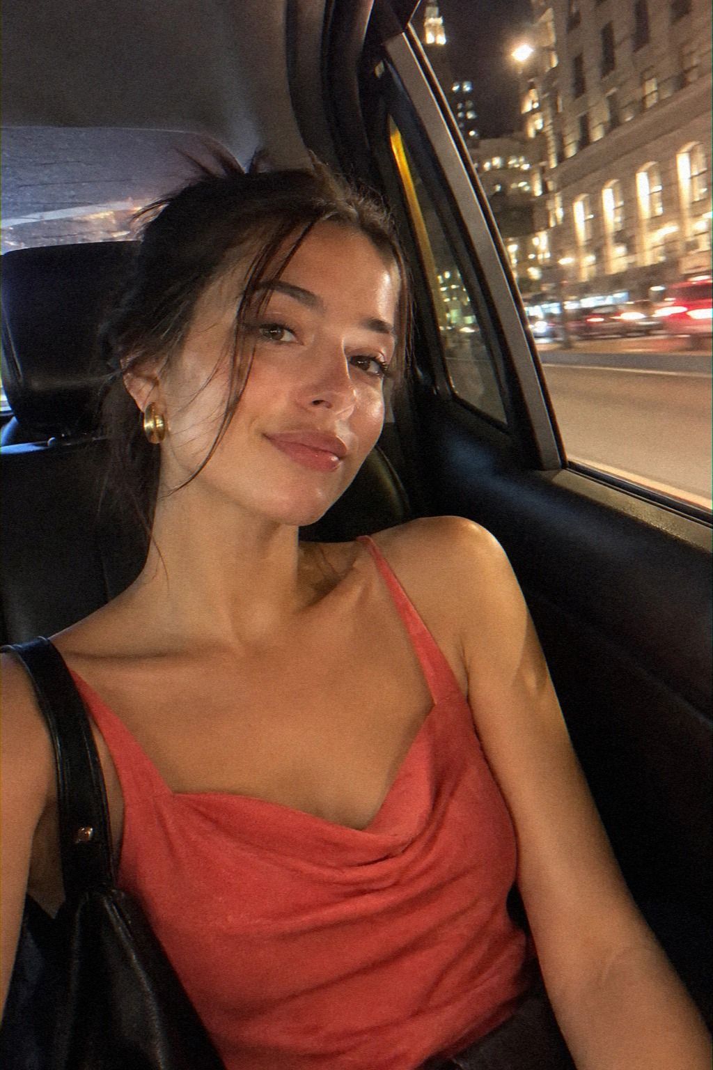
Coral brings warmth to the frame, but it needs restraint around the face. A saturated coral blouse looks lively with a pale background, while a dusty coral becomes quieter and more refined. The stronger shade can be a good choice when the webcam makes neutral colors look flat.
Accessories change the result quickly. Simple earrings add definition without competing with the neckline. Small hoops or polished studs work better than a long pendant that moves into the crop.
A matte knit also keeps the color grounded when the blouse has a relaxed shape.
The best combination is one warm color, one clean neckline, and no reflective detail close to the cheeks. That’s a high-value adjustment because it costs nothing if you already own the right accessories. A coral top can look polished without requiring a complete outfit purchase.
If the color feels too loud, choose a softer undertone rather than abandoning the whole family. The coral pairing shows how little the accessory needs to do. You’ll get a confident result with a surprisingly simple formula.
5Emerald vs. Navy: The Dark Color Split
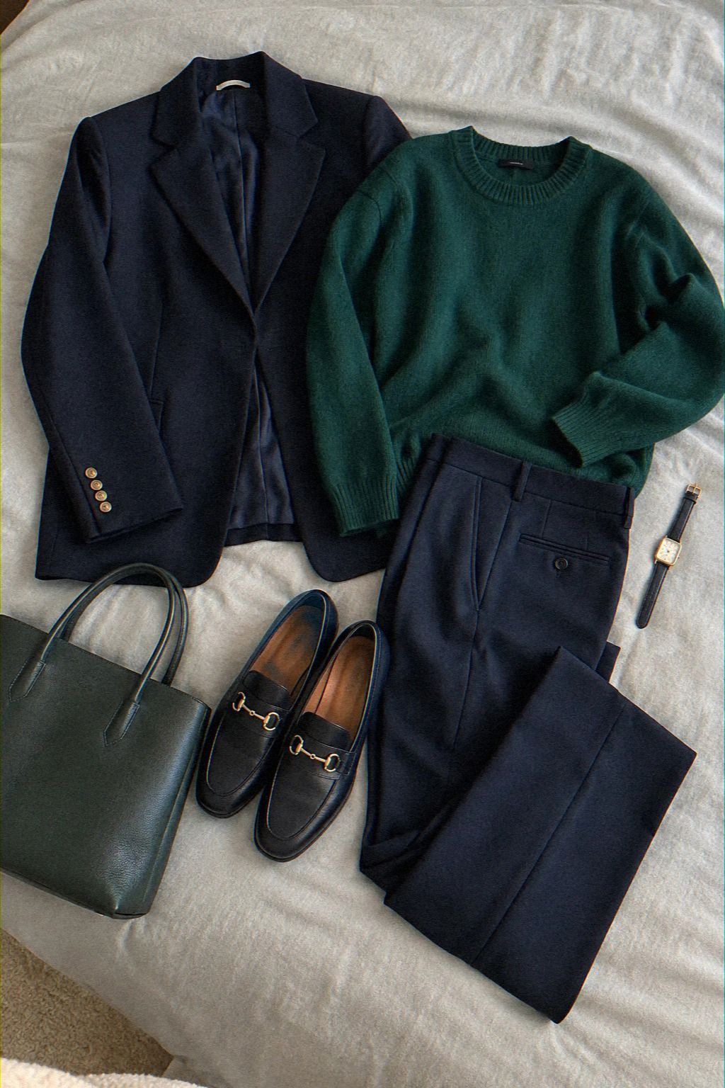
Emerald and navy both look serious, but they communicate different energy. Navy blends gently into the frame and makes the neckline feel crisp, while emerald gives the image more lift against a pale background. The comparison requires looking at collars, sleeves, and fabric surfaces rather than judging color alone.
The Dark Color Split helps clarify the choice: navy is the quieter professional option, and emerald is the stronger editorial option. I’d choose navy for a conservative interview with a dark background, but I wouldn’t call it the universal winner. It can flatten into charcoal when the camera is underexposed.
Emerald needs more care with accessories, yet its woven texture stays visible in the paused frame. Minimal earrings keep the richer color from becoming too dramatic. If you’re deciding whether a new top is worth buying, compare it with the navy pieces already in your wardrobe.
The emerald-versus-navy comparison is especially useful when you want one workwear top with repeat use. It’s a sophisticated choice for anyone who wants more visual energy than basic black.
6Why Ivory Needs Brighter Daylight
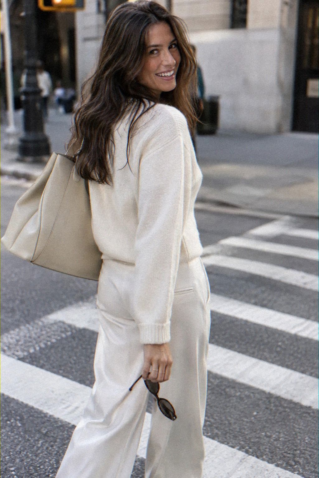
Ivory looks elegant in strong window light, especially in a structured blouse with a subtle stand collar. Under dim indoor light, however, the shade drifts toward gray and loses the contrast that makes the neckline readable.
A pale top can work beautifully when the background is darker and the light reaches the face evenly. It becomes less dependable beside a white wall, a bright window, or an overexposed webcam. Bright daylight gives the cleanest result, while a warmer lamp makes the fabric look yellow.
For a practical purchase, choose matte cotton or a softly textured weave instead of glossy ivory satin. The surface handles compression more gracefully and usually offers better everyday value. A pale blouse also deserves a return check, because the shade may look different under store lighting.
The ivory daylight check is a useful step before committing to a light-colored top. Don’t choose ivory simply because it looks elegant on a hanger. The background and light have to cooperate.
7Check the Neckline Window
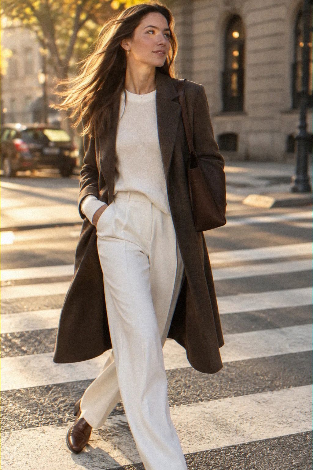
The neckline matters almost as much as the color. Move each top beside the webcam crop and look at where the collar ends relative to the chin and shoulders. A shallow crew neck makes a dark top feel heavier, while a modest V-neck creates more open space.
I call this the Neckline Window, the visible area between the face and the top’s upper edge. A clean scoop, narrow V, or open shirt collar gives the frame more breathing room than a high decorative ruffle. You’ll want the neckline to remain visible after you sit back, because an attractive collar can vanish when the camera is positioned too low.
I’d skip oversized bows and a stiff pleat for a video interview. They may be charming in person, but they compete with expression. If you wear glasses, the quieter neckline usually keeps the whole crop balanced.
A top with the right neckline can deliver more value than a trendier blouse that needs constant adjustment. Check the Neckline Window before deciding whether the garment is worth the cost. It’s one of the most reliable ways to make a simple top feel intentional.
8Try Burgundy When Black Feels Harsh
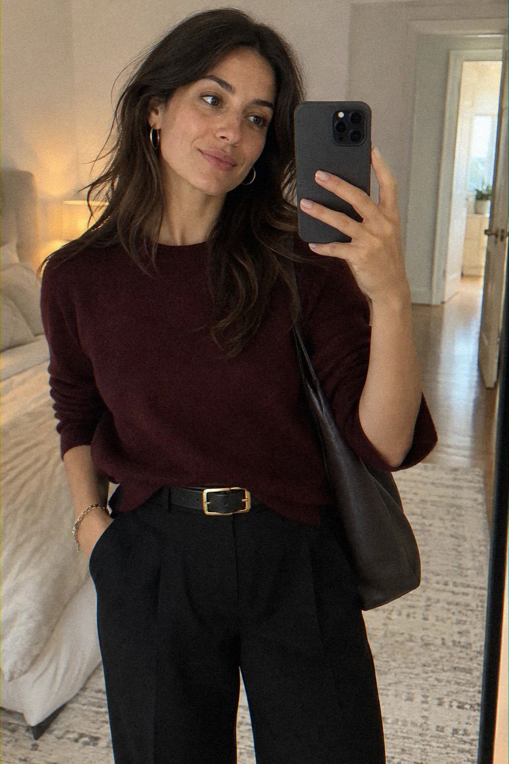
The Soft Contrast Swap became my favorite move in this group: replace black with a dark color that still has visible undertones. Burgundy, oxblood, and muted wine shades create a rich frame without the severe edge that black can bring to a small crop.
I’d choose a matte burgundy blouse when the background is pale, cool, or slightly green. The color doesn’t demand a dramatic neckline, and it pairs easily with charcoal, navy, cream, or dark denim outside the interview. It’s a refined alternative when a black top makes the face look tired.
Gloss changes the result. A satin burgundy can look luxurious in person but become a restless patch of reflected light on screen. A brushed crepe, cotton blend, or softly ribbed knit gives the shade a more stable and flattering finish.
If the color feels too dramatic, choose a washed wine tone rather than abandoning the family. The jewel-tone comparison explains why burgundy can work where navy feels too quiet. You’ll get warmth, contrast, and a memorable finish without adding complicated accessories.
9Mustard’s Warm Frame Check
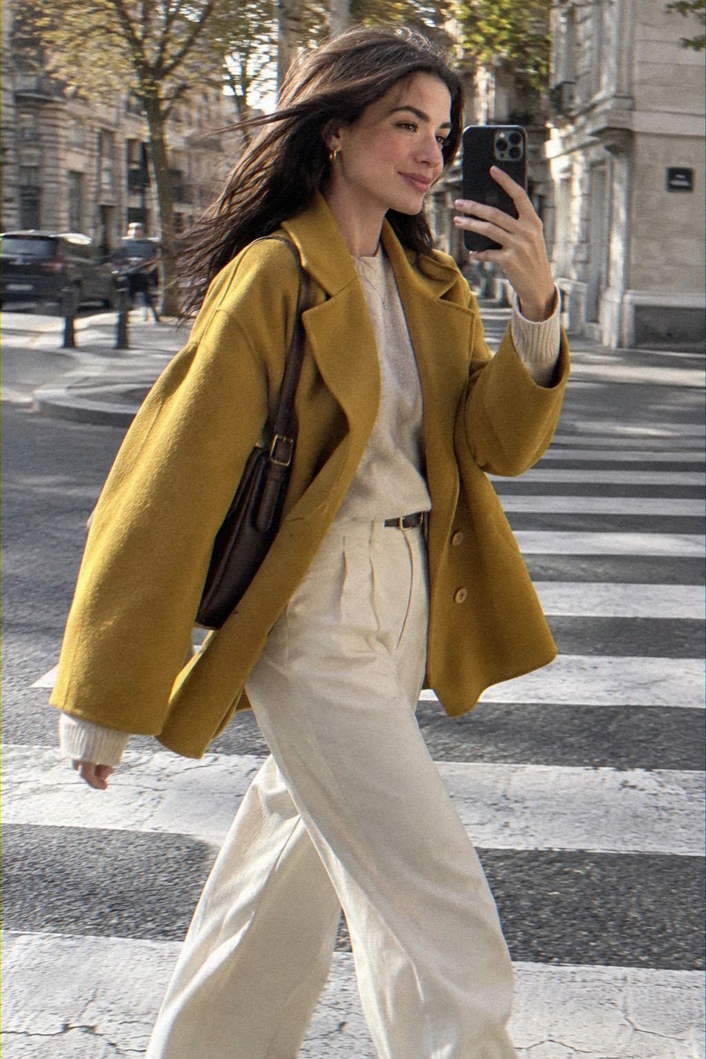
The Warm Frame Check asks one useful question: does the color still look intentional after your camera lowers the saturation?
10Could Lavender Be the Softer Pick?
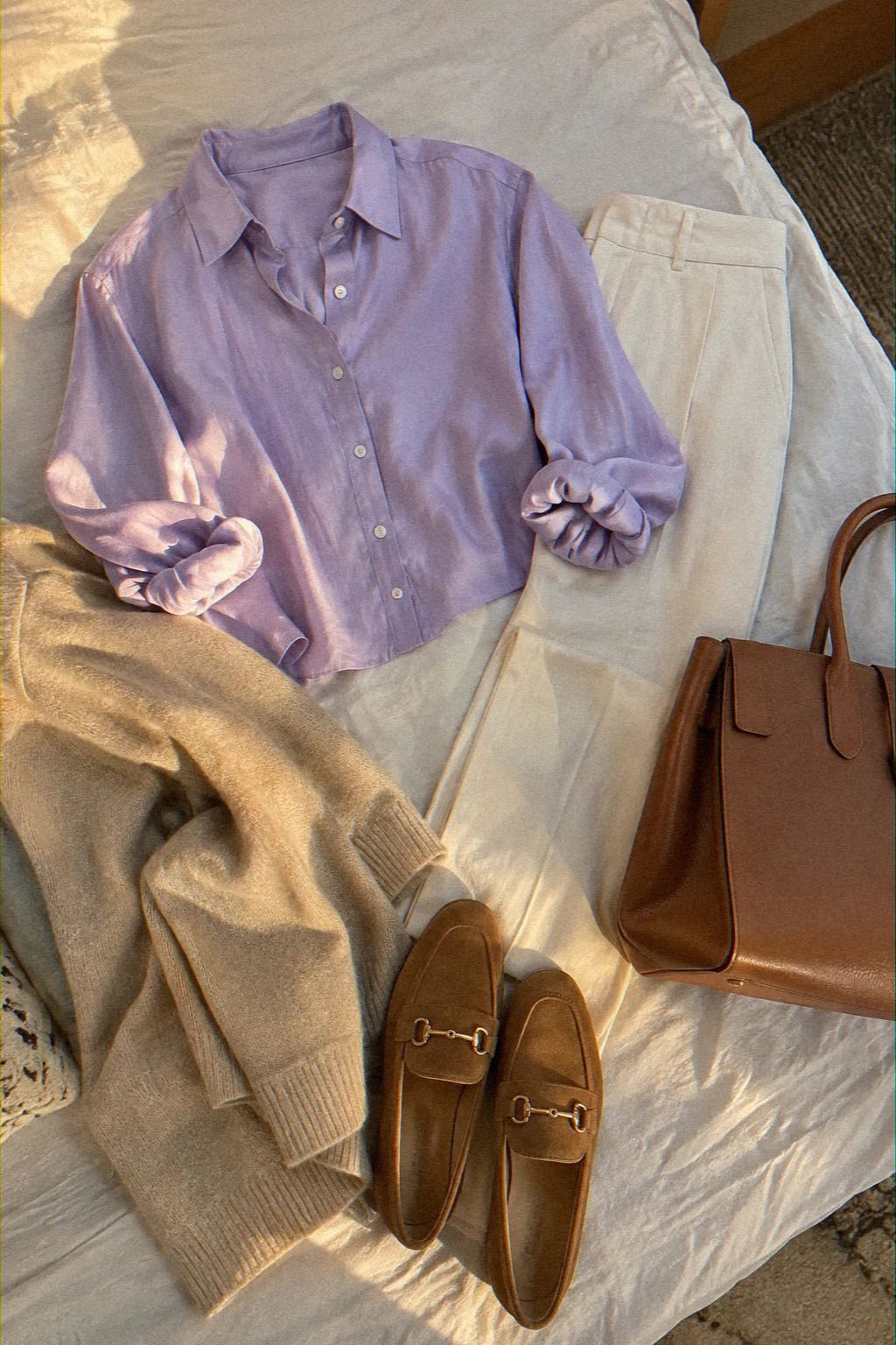
Lavender gives the frame a softer contrast than cobalt or emerald, but it still separates from a warm neutral wall. The shade looks most dependable when the fabric has enough body to hold the shoulder line.
A fine-gauge knit creates a relaxed, polished effect without looking overly formal. Very thin lavender fabric becomes translucent under strong daylight, while a denser weave keeps the color cleaner. A slightly grayed lavender also performs better than an icy version beside a muted gray background.
This is a useful option when bright colors feel too forceful but ivory looks washed out. The shade has presence without becoming the main subject of the frame. It can also offer strong buying value if you need one blouse for interviews, presentations, and everyday workwear.
See the lavender option when your shortlist needs a softer alternative. It’s gentle, modern, and more distinctive than another pale neutral.
11The Still Frame Decision
Every top needs a paused-frame check before it becomes the favorite. A blouse with beautiful drape may collapse when you sit, while a basic cotton shirt can keep its collar and shoulder line perfectly. The camera reveals details that a quick mirror glance can miss.
My Still Frame Decision uses three checks: visible color, stable neckline, and fabric texture. A top is not successful if it only looks good while you are moving. It needs to hold its shape while your expression changes and your hands enter the frame.
Choose a medium-weight fabric over a delicate weave that wrinkles at the first bend. Then record the same short answer in each top and watch once with sound and once muted. This costs nothing, but it can prevent an unnecessary purchase.
A little imperfection is useful here. It shows what the camera will really see. That makes the test more reliable than judging the garment under flattering store lighting or deciding from the price alone.
Use the still-frame decision after narrowing the colors. Don’t let a dramatic first impression outweigh a stable, comfortable, dependable result.
12The Vividness Hold Test
The final choice is the shade that stays recognizable across different backgrounds and light levels. A vivid color isn’t automatically the winner. It must remain balanced when the webcam lowers contrast, the room gets darker, or the crop becomes smaller.
The Vividness Hold Test uses three questions:
1. Does the color keep a clear boundary around the face? 2.
Does the fabric remain matte or visually stable? 3. Does the neckline stay visible when you sit naturally?
A strong cobalt may pass all three checks, while a softer burgundy may look better in cool light. Lavender can be the more flattering choice against a warm wall. Navy may be the safest option when the background is already busy.
I’d keep the top that needs the fewest adjustments. If you’re pulling at the collar, moving away from glare, or worrying about a shifting pattern, the color isn’t doing enough useful work. That’s why the cobalt test, burgundy swap, and neckline check belong in the same final comparison.
The best result feels confident, clear, and quietly polished. It doesn’t need to be the loudest shade in your wardrobe.
How Much It Cost
This edit does not have one honest total because the point is color testing with pieces already available, not buying a fixed collection. Your cost can be zero if you test tops you own, modest if you shop a secondhand rack, or higher if you choose a new silk, wool, or tailored blouse.
I’d spend first on fabric that keeps its surface quiet and a neckline that stays visible when you sit back. You don’t need twelve new garments to learn which colors work for your camera. Start with three shades, record the same short answer, and compare the frames.
If one top wrinkles, reflects, or disappears, return it before you spend more. The test helps separate a genuinely useful purchase from an attractive but low-value one.
For a fast shopping route, revisit the cost breakdown after checking the Vividness Hold Test. It’s a practical way to protect your budget while still finding something memorable.
The Color Decision I’d Make After Testing
I went into this edit expecting the brightest color to win, but that wasn’t the useful lesson. Camera-friendly color is less about chasing intensity and more about keeping a readable boundary around the face. A strong cobalt can look excellent, yet a softer burgundy may feel more natural if the lighting is cool.
I also stopped treating every attractive top as an interview top. A delicate print may be lovely at lunch and still flicker beside a moving face.
A glossy blouse may feel luxurious in person and turn into a patch of light onscreen. These aren’t flaws in the clothes.
They’re mismatches between fabric behavior and a small digital frame.
The most useful test is boring in the best way. Put the top on, sit where you’ll take the call, and record the first answer you expect to give.
Watch it once with sound and once muted. Does the color stay clear? Does the neckline remain visible?
Does the fabric pull your attention every time you move?
The camera rewards clarity, not effort. A refined top can still feel relaxed when it gives you one less thing to manage. That’s why matte surfaces, medium contrast, and a simple silhouette kept winning.
The final color decision should come from the paused thumbnail, not from how dramatic the top looks in your closet. You’ll get a more reliable answer from a quiet comparison than from an exciting impulse purchase.
What People Always Want to Know
What are the best Zoom interview tops in colors that look great on camera?
Cobalt blue and matte burgundy are the clearest picks in this edit. Both give the face visible contrast without relying on a print. A defined neckline matters just as much, so look for a clean collar, scoop, or narrow V that stays visible when you sit back.
Where can I buy these tops on a budget?
Start with your own wardrobe, then check thrift stores, consignment racks, and resale listings for solid cotton poplin, matte crepe, or fine-gauge knit tops. Secondhand shopping can offer better value without requiring a complete new outfit, and you can inspect the fabric before buying.
How much does a camera-friendly interview top cost?
It can cost nothing if you test tops you already own. A secondhand blouse may cost less than a new workwear piece, while premium silk or tailored fabric will vary by brand and construction. The camera test itself only needs your webcam, a chair, and steady light.
Can I create a strong interview outfit on a budget?
Yes. Begin with three existing tops in different color families.
Record the same answer, pause the footage, and compare cobalt, navy, burgundy, coral, or lavender. A no-buy comparison often tells you more than purchasing another blouse before you understand your lighting.
Is a camera-friendly top worth it in a small space?
Yes, because a small crop makes the garment’s color and neckline more important. Choose one solid shade, keep competing details away from the face, and check that the collar remains visible. Clear framing can make a simple top look more considered than a busier outfit.
Is it worth buying a special top for a rental webcam?
Usually, no. Test the tops you already own first, then spend only if your current options reflect light, disappear against your background, or lose their neckline. A no-damage adjustment to your seat and light may improve the result more than a new blouse.
Where I’d Start First
If I had to pick one, I’d start with cobalt blue. It keeps its edge in a small frame, stays readable beside neutral backgrounds, and doesn’t need a busy accessory to look finished.
Test it in your actual chair, compare the paused frame, and use the starting-point checklist before you buy anything. If cobalt feels too strong, move to matte burgundy or muted lavender, then apply the same Vividness Hold Test.